‘Jump Back In’ feature
Driving retention through a Beachbody homepage redesign
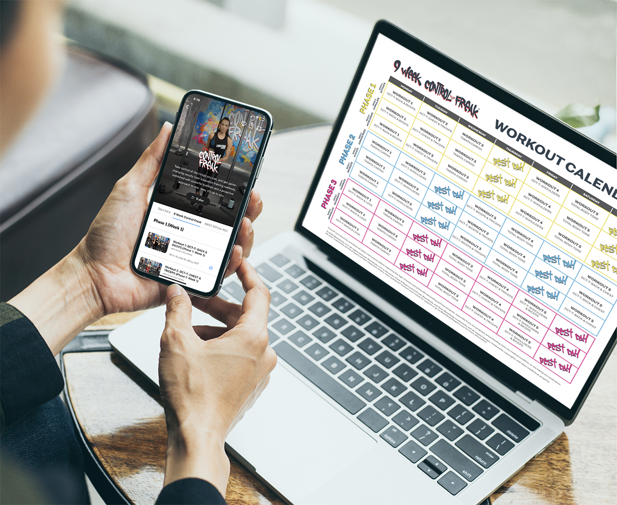
With over 3 million paid subscribers, Beachbody's mobile app centered around structured fitness programs - curated workout series paired with guided calendars.
When data revealed that program followers churned at lower rates, the business imperative became clear: encourage users to jump back into their active programs and maintain their fitness momentum.
Discovery
We launched the project with a focused discovery phase to establish our foundation. Through analytics review and synthesis of existing user research, we aligned on KPIs, identified key user segments, and mapped current behaviors across our program ecosystem.
This exploration surfaced several constraints we'd need to navigate:
Non-linear progression: Users don't always follow programs sequentially, skipping ahead or revisiting favorite workouts based on their goals and schedules
Scale complexity: Programs ranged dramatically in scope, with some containing up to 100 individual workouts that needed intuitive navigation.
Schedule flexibility: Many programs offered multiple workout calendar options, requiring users to select and commit to a specific path.

After aligning on our strategy and use cases, we started our UX exploration. We first researched any existing patterns that could be familiar to users. Streaming a TV show seemed like a similar task, so we looked to streamers like Netflix, Hulu and Amazon. However, these references were too simplistic, and didn’t account for the varied use cases we needed to cover.
Other streaming apps didn’t offer good references
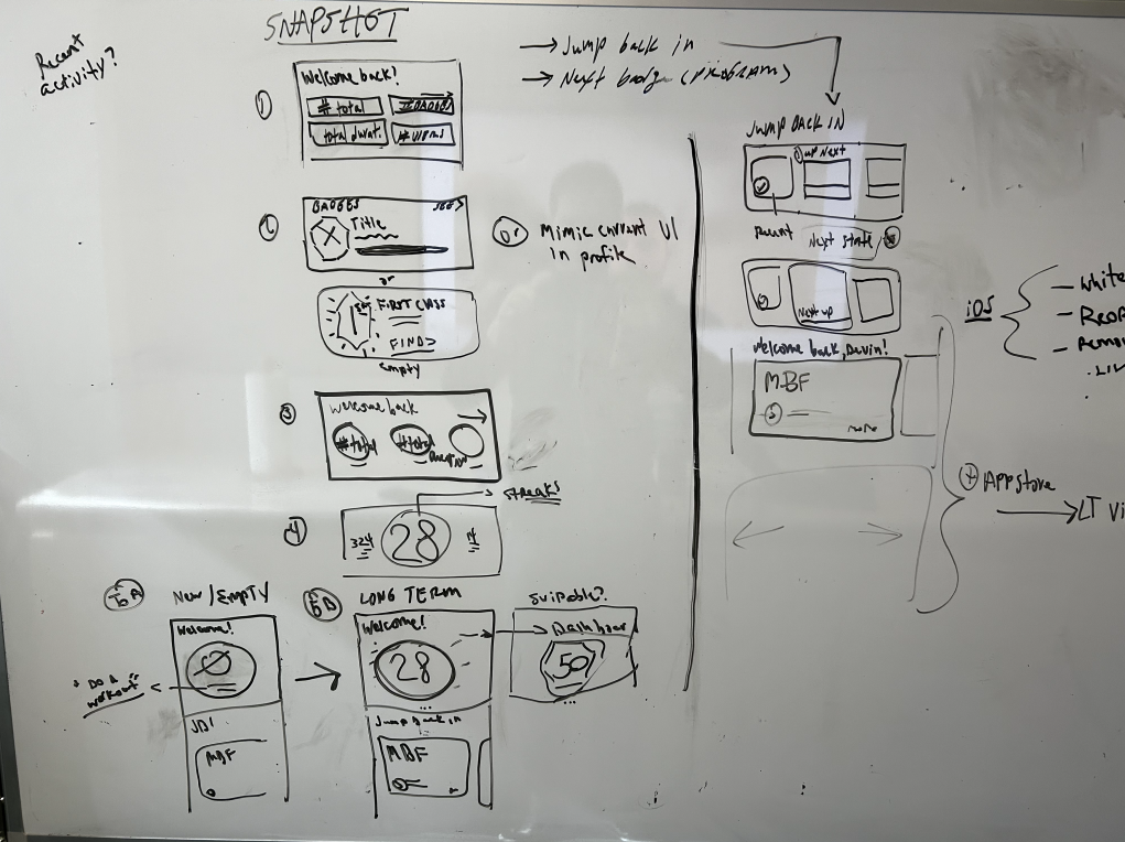
We explored UI options in a workshop and did user testing
We gathered Engineering, Product, Design, and stakeholders for a workshop to sketch solutions against four key principles: minimize taps to re-entry, surface progress organically, support non-linear engagement, and create emotional motivation to return.
Following that workshop, we designed 2 main concepts and tested them with users:
Showing the user’s progress: Show users how far they've come in their program to create a sense of achievement and forward momentum.
Helping users jump back in: Present upcoming workouts in an intuitive interface that makes it effortless to pick up where they left off - or jump to a different workout if needed.

The final design
User testing validated both concepts, but technical constraints around progress tracking guided us toward the second approach: surfacing upcoming workouts. We designed the solution, partnered with Engineering through development, and launched on mobile.
After monitoring performance and refining based on analytics, we expanded the feature to our home screen across web, TV, and connected bike platforms - making program re-engagement a centerpiece of the user experience.
The final module included:
Motivating copy: A welcome message and a "Jump Back In" header created an emotional hook for users with active programs.
Flexible navigation: Horizontal scrolling through all program workouts accommodated non-linear usage patterns.
Intelligent suggestion: The recommended "next" workout was highlighted prominently to reduce decision fatigue while preserving choice.
Program switching: A carousel of recent programs enabled users to seamlessly move between multiple active fitness journeys.
The results
The new module was a huge hit with users. In the months after launch, it accounted for over 50% of all home screen interactions, across platforms.
I’d love to hear from you
Email me at andrewturrell@gmail.com to chat about a role or project. I’m open to full-time or freelance.