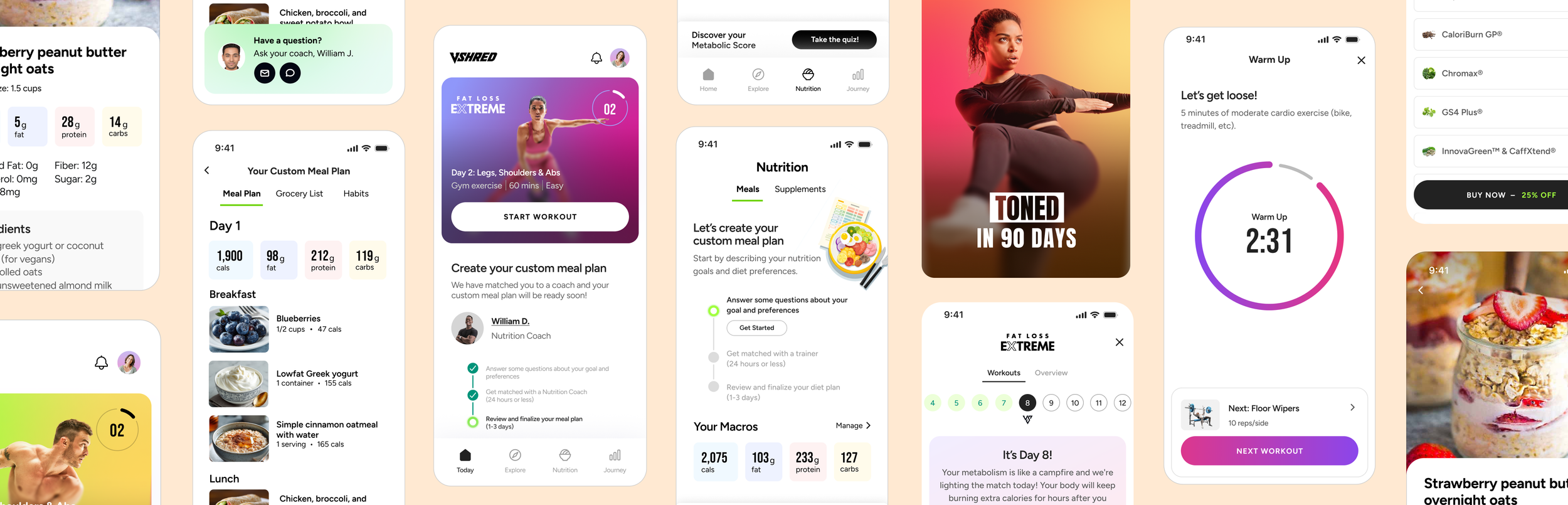
Redesigning a leading health & nutrition app
V Shred needed a new app that would drive acquisition, appeal to a new audience, and improve retention for paying users.
I was a hands-on lead of a small team that created a design system, user flows, wireframes, visuals, and prototypes, and did user testing with our user base.
Customers struggled to understand and use their products
V Shred’s main challenge was that they had various nutrition and fitness products with complex logic and Engineering constraints, leading to user confusion.
To solve this, we started by inventorying the content and required steps, mapping out ideal flows, then designing UI that focused on informing users of their state and what they needed to do next.
Much of that content and user instruction came together on the app’s Home tab. We tested the copy and different page layouts with users and iterated based on their feedback.
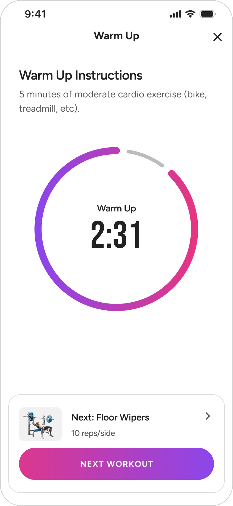
Workout experience
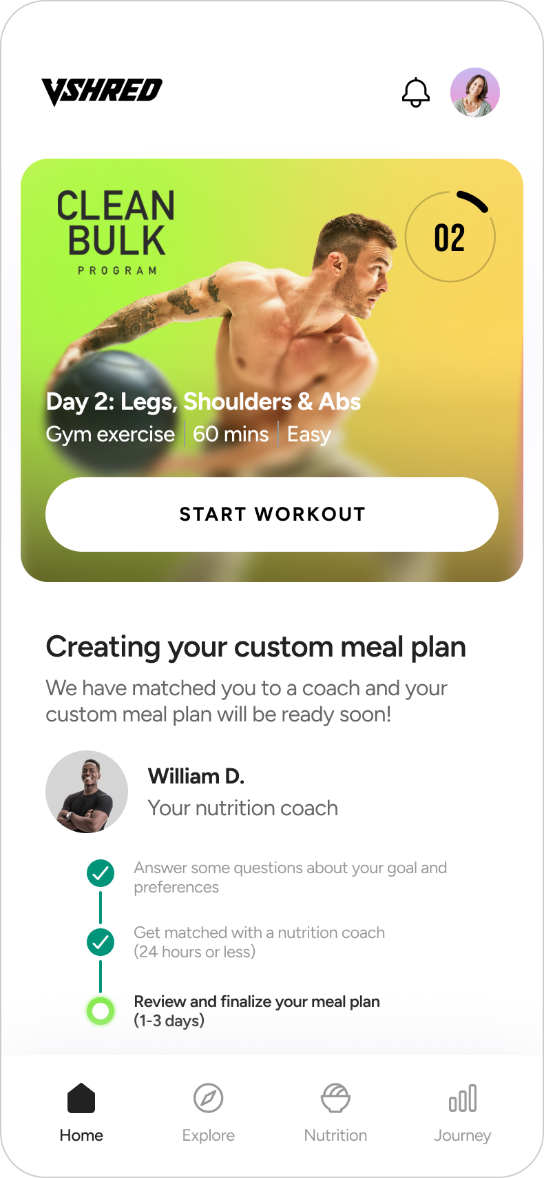
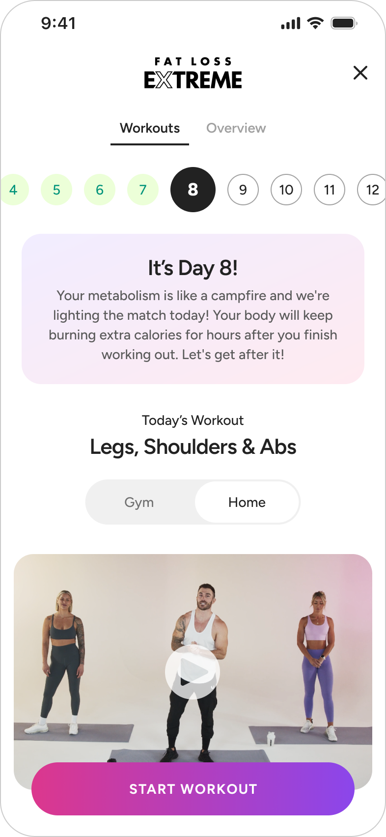
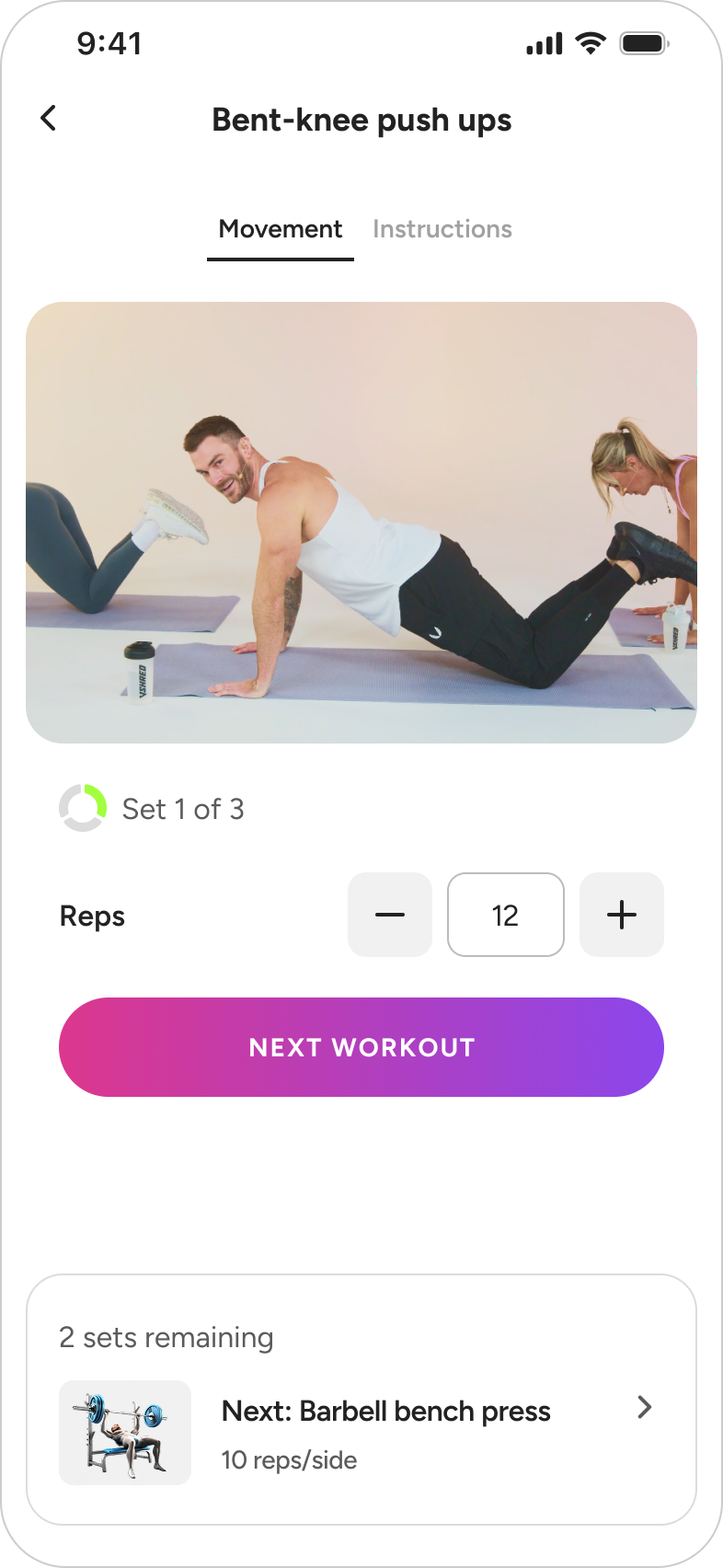
At the core of the app were the fitness programs – each with 90 days of curated workouts. We designed an experience focused on motivating users, with a clear, fun, easy-to-follow flow. I collaborated with the video production, CMS, and Dev teams to make sure we carried this clear, motivating vision throughout every aspect of the experience.
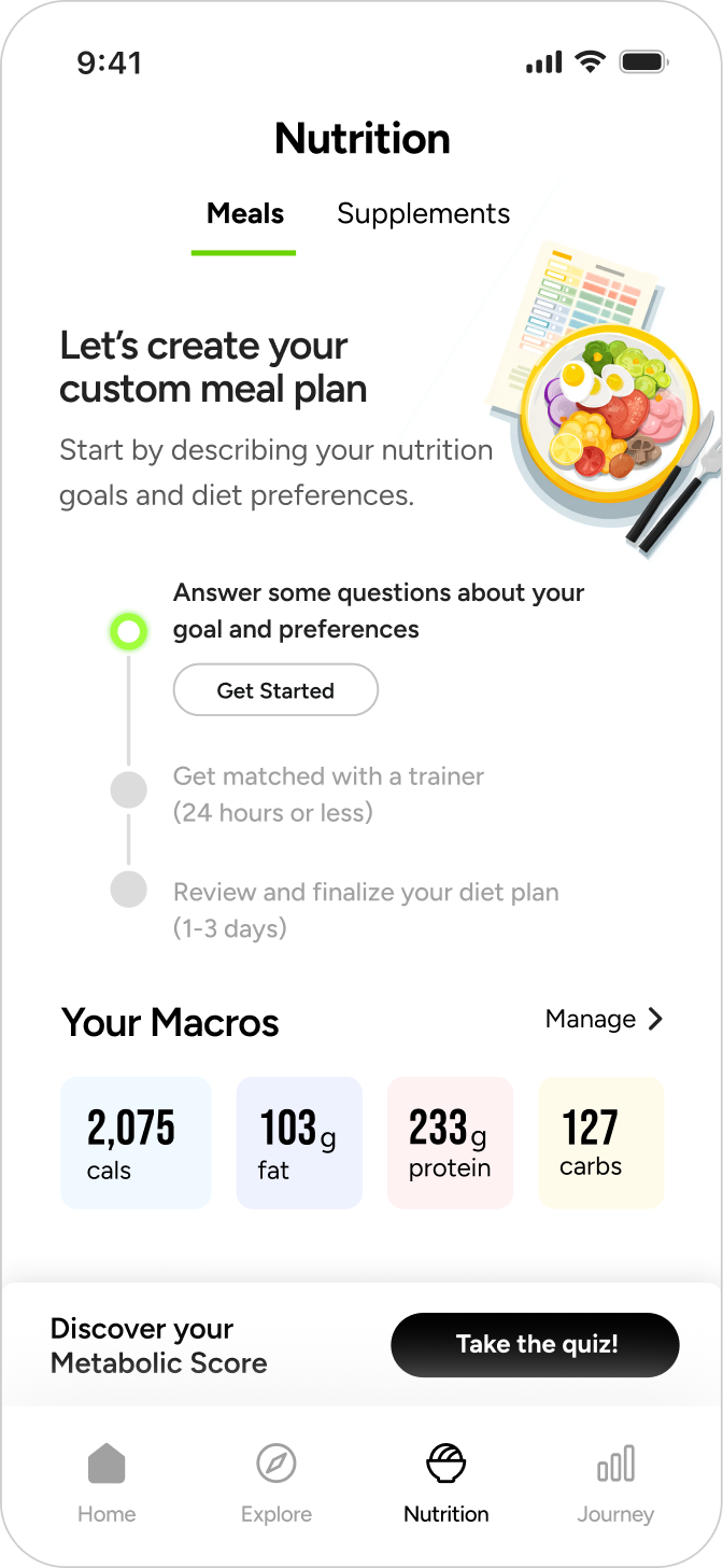
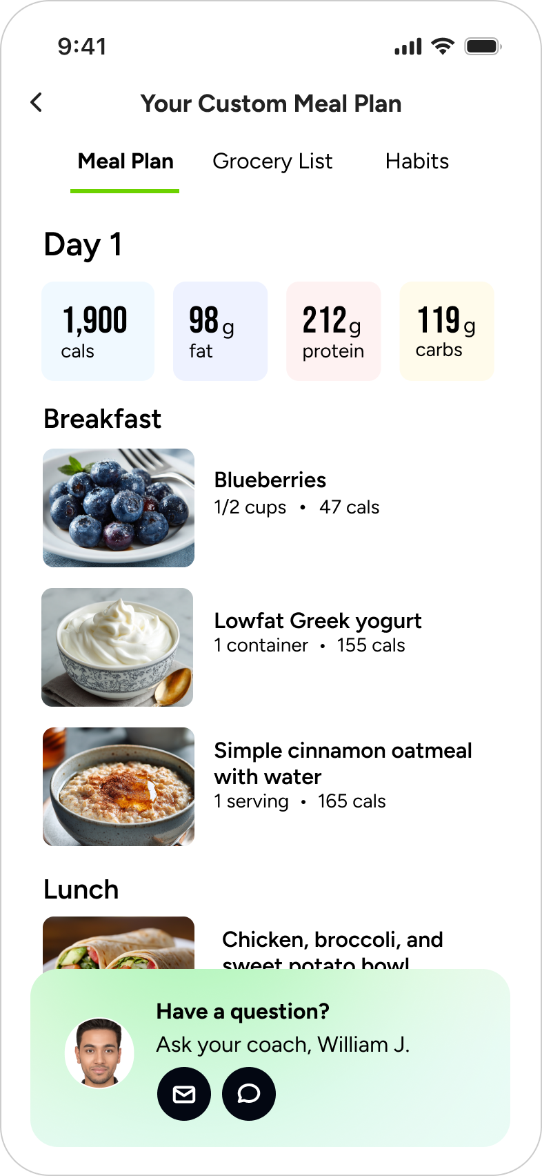
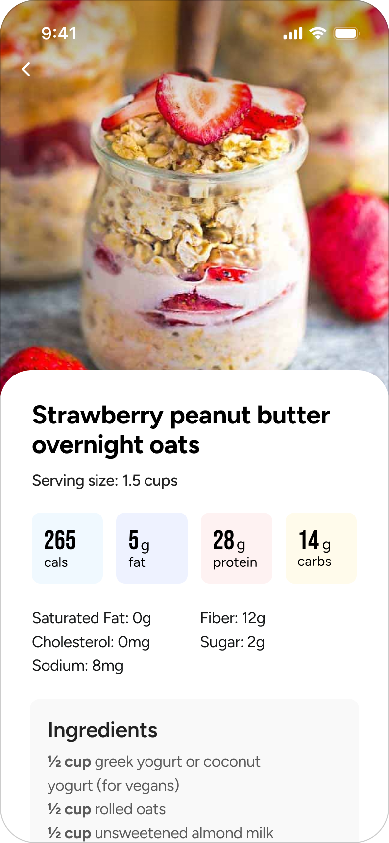
Personalized meal planning
V Shred offers a custom meal plan subscription, where users answer a series of questions about their goals and eating preferences, a nutritionist ‘coach’ sets up a daily meal plan, and then the user and the coach can adjust the plan as needed.
Users had been encountering various pain points: understanding the status of their meal plan, contacting their coach, and understanding their macro targets.
The app clarified these areas and enabled users to go through the entire experience: purchase the subscription, view their meals and interact with their coach.
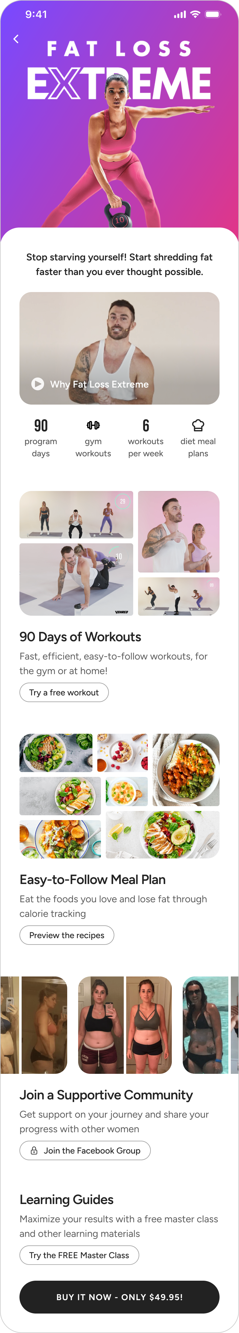
Landing pages that drive conversion
One area of focus was landing pages. With the new app, driving revenue was critical, so we focused on a narrative and interactions that would convert.
This page was for a fitness program, and we included several key strategies:
We prominently showed a video led by a trainer with a passionate fanbase. On other platforms, V Shred had seen that having a video was the most critical driver to conversion.
Content previews, such as a free workout would increase time in the app before purchase and helped the users understand and trust in what they would be getting.
In user testing, community support and showing program results also built trust in the program, so we included links to the Facebook group, with before and after photos.
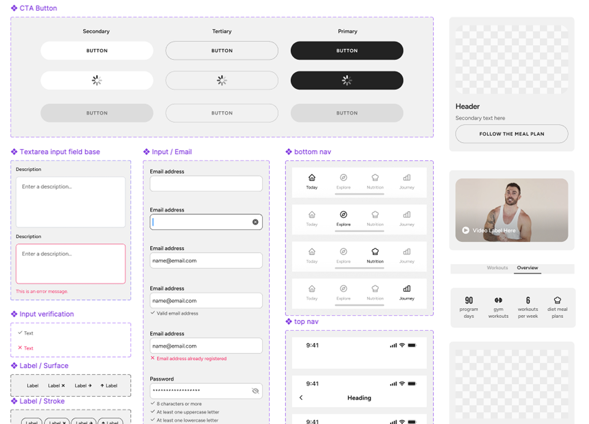
A system-focused approach
V Shred was a fast-moving company, with products and priorities constantly evolving. A key focus was designing a UI that was both scalable and adaptable to support rapid changes.
We built our files entirely from global elements, emphasizing reuse and taking a holistic approach to the app’s design.
Throughout this process, we partnered closely with Engineering, sharing the goal of driving efficiency and streamlining development.
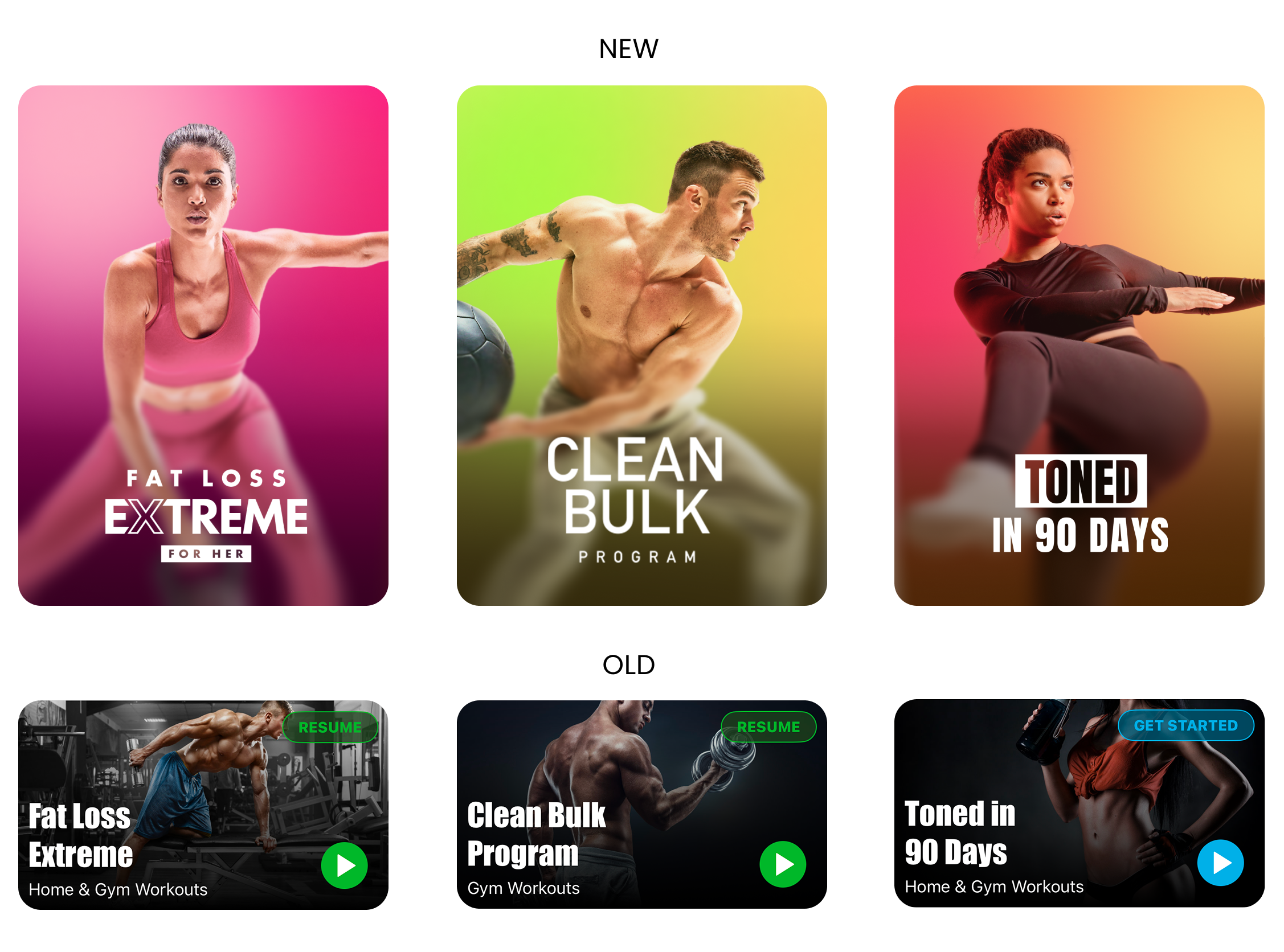
Reimagining the brand experience
V Shred’s audience had shifted from mostly male to an older female demographic, requiring a new color palette and brand presentation. Research showed these users preferred bright colors, lots of images, and photos of fit but relatable people.
One area of the app that reflected this new aesthetic was the new fitness program branding. We replaced dark, brooding visuals and overly muscular trainer photos with bright colors, trainers with more relatable physiques, and with dynamic poses (see the comparison below).
This aesthetic extended across the design system, influencing fonts, colors, and icon shapes.
The new app is currently in development. Stay tuned!
I’d love to hear from you
Email me at andrewturrell@gmail.com to chat about a role or project. I’m open to full-time or freelance.